
This blog post originally started out as a way to point out why the NVD CVSS scores are usually wrong. One of the amazing things about having easy access to data is you can ask a lot of questions, questions you didn’t even know you had, and find answers right away. If you haven’t read it yet, I wrote a very long series on security scanners. One of my struggles I have is there are often many “critical” findings in those scan reports that aren’t actually critical. I wanted to write something that explained why that was, but because my data took me somewhere else, this is the post you get. I knew CVSSv3 wasn’t perfect (even the CVSS folks know this), but I found some really interesting patterns in the data. The TL;DR of this post is: It may be time to start talking about CVSSv4.
It’s easy to write a post that made a lot of assumptions and generally makes facts up that suit whatever argument I was trying to make (which was the first draft of this). I decided to crunch some data to make sure my hypothesis were correct and because graphs are fun. It turns out I learned a lot of new things, which of course also means it took me way longer to do this work. The scripts I used to build all these graphs can be found here if you want to play along at home. You can save yourself a lot of suffering by using my work instead of trying to start from scratch.
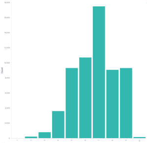 CVSSv3 scores
Firstly, we’re going to do most of our work with whole integers of CVSSv3 scores. The scores are generally an integer and one decimal place, so for example ‘7.3’. Using the decimal place makes the data much harder to read in this post and the results using only integers were the same. If you don’t believe me, try it yourself.
So this is the distribution of CVSSv3 scores NVD has logged for CVE IDs. Not every ID has a CVSSv3 score which is OK. It’s a somewhat bell curve shape, which should surprise nobody.
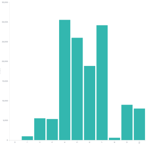 CVSSv2 scores
Just for the sake of completeness and because someone will ask, here is the CVSSv2 graph. This doesn’t look as nice, which is one of the problems CVSSv2 had, it tended to favor certain scores. CVSSv3 was built to fix this. I simply show this graph to point out progress is being made, please don’t assume I’m trying to bash CVSSv3 here (I am a little). I’m using this opportunity to explain some things I see in the CVSSv3 data. We won’t be looking at CVSSv2 again.
Now I wanted something to compare this data to, how can we decide if the NVD data is good, bad, or something in the middle? I decided to use the Red Hat CVE dataset. Red Hat does a fantastic job capturing things like severity and CVSS scores, their data is insanely open, it’s really good, and its’ easy to download. I would like to do this with some other large datasets someday, like Microsoft, but getting access to that data isn’t so simple and I have limited time.
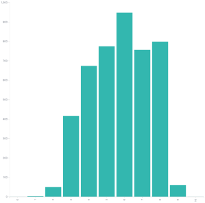 Red Hat CVSSv3 scores
Here are the Red Hat CVSSv3 scores. It looks a lot like the NVD CVSSv3 data, which given how CVSSv3 was designed, is basically what anyone would expect.
Except it’s kind of not the same it turns out. If we take the NVD score and subtract it from the Red Hat score for every CVE ID and graph the rest we get something that shows NVD likes to score higher than Red Hat does. For example let’s look at CVE-2020-10684. Red Hat gave it a CVSSv3 score of 7.9, while NVD gave it 7.1. This means in our dataset the score would be 7.1 - 7.9 = -0.8
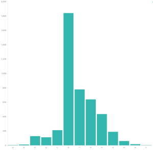 Difference between Red Hat and NVD CVSSv3 scores
This data is more similar than I expected. About 41 percent of the scores are within 1. The zero doesn’t mean they match, very few match exactly. It’s pretty clear from that graph that the NVD scores are generally higher than the Red Hat scores. This shouldn’t surprise anyone as NVD will generally error on the side of caution where Red Hat has a deeper understanding of how a particular vulnerability affects their products.
Now by itself we could write about how NVD scores are often higher than they should be. If you receive security scanner reports you’re no doubt used to a number of “critical” findings that aren’t very critical at all. Those ratings almost always come from this NVD data. I didn’t think this data was compelling enough to stand on its own, so I kept digging, what other relationships existed?
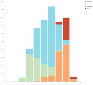 Red Hat severity vs CVSSv3 scores
The graph that really threw me for a loop was when I graphed the Red Hat CVSSv3 scores versus the Red Hat assigned severity. Red Hat doesn’t use the CVSSv3 scores to assign severity, they use something called the Microsoft Security Update Severity Rating System. This rating system predates CVSS and in many ways is superior as it is very simple to score and simple to understand. If you clicked that link and read the descriptions you can probably score vulnerabilities using this scale now. Knowing how to use CVSSv3 will take a few days to get started and long time to be good at it.
If we look at the graph we can see low are generally on the left side, moderate in the middle, high toward the right, but what’s the deal with those critical flaws? Red Hat’s CVSSv3 scores place things as being in the moderate to high range, but the Microsoft scale says they’re critical. I looked at some of these, strangely Flash Player accounts for about 2/3 of those critical issues. That’s a name I thought I would never hear again.
The reality is there shouldn’t be a lot of critical flaws, they are meant to be rare occurrences, and generally are. So I kept digging. What are the relationship between the Red Hat severity and NVD severity? The NVD severity is based on the CVSSv3 score.
This is where my research sort of fell off the rails. The ratings provided by NVD and the ratings Red Hat assigns have some substantial differences. I have a few more graphs that help drive this home. If we look at the NVD rating vs the Red Hat ratings, we see the inconsistency.
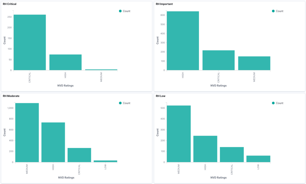 NVD severity vs Red Hat severity
I think the most telling graph here is the Red Hat Low vulnerabilities are mostly medium, high, and critical from the NVD CVSSv3 scoring. That strikes me as being a problem. I could maybe understand a lot of low and moderate issues, but there’s something very wrong with this data. There shouldn’t be this many high and critical findings.
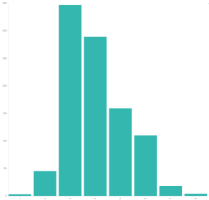 Red Hat severity vs CVSSv3 scores
Even if we graph the Red Hat CVSSv3 scores for their low issues the graph doesn’t look like it should in my opinion. There’s a lot of scoring that’s a 4 or higher.
Again, I don’t think the problem is Red Hat, or NVD, I think they’re using the tools they have the best they can. Now it should be noted that I only have two sources of data, NVD and Red Hat. I really need to find more data to see if my current hypothesis holds. And we can easily determine if what we see from Red Hat is repeated, or maybe Red Hat is an outlier.
There are also some more details that can be dug into. Are there certain CVSSv3 fields where Red Hat and NVD consistently score differently? Are there certain applications and libraries that create the most inconsistency? It will take time to work through this data, I’m not sure how to start looking at this just yet (if you have ideas or want to try it out yourself, do let me know). I view this post at the start of a journey, not a final explanation. CVSS scoring has helped the entire industry. I have no doubt some sort of CVSS scoring will always exist and should always exist.
The takeaway here was going to be an explanation of why the NVD CVSS scores shouldn’t be used to make decisions about severity. I think the actual takeaway now is the problem isn’t NVD, well, they sort of are, but the real problem is CVSSv3. CVSSv3 scores shouldn’t be trusted as the only source for calculating vulnerability severity.